tpr = 0.95
fpr = 0.05

base_rate = 0.01

precision = tpr * base_rate / (tpr * base_rate + fpr * (1 - base_rate))
print(f"{precision = :.2}")
precision = 0.16In classification tasks, the base rate of the positive class (or the rarity of positive cases) puts a ceiling on your model’s precision, or how often its positive class predictions are correct. When the base rate is low enough, even a strong model will flood you with false positives. If you’re working in a low base rate setting — fraud detection, rare disease screening, content moderation — it’s worth computing that ceiling before you start tuning your model.
Say you’re building a model to flag fraudulent credit card transactions. Your model takes in some features, outputs a probability, and you classify a transaction as fraudulent if that probability exceeds some threshold \(t\). To evaluate your model, you’d naturally want to look at two things: the true positive rate, also called recall (what fraction of actual frauds does the model catch?) and the false positive rate (what fraction of legitimate transactions does the model incorrectly flag?).
But there’s a third quantity worth paying attention to: precision. Precision answers the question “of all the transactions the model flagged, how many are actually fraudulent?” If each flag triggers a costly human review, precision tells you how much of that effort is wasted on false positives.
Here’s the problem. Fraudulent transactions make up less than 1% of all credit card activity. When the positive class is that rare, even a model with strong TPR and low FPR can have very low precision — most of its flags will be false positives.
This post walks through why that happens — first with a single example, then with a full model — and what precision you can realistically expect when the positive class is rare.
Let’s start with the four probabilities in the standard confusion matrix. Below, \(y\) is an observation’s true class and \(\hat{y}\) is the model’s predicted class — both take a value of \(1\) (positive) or \(0\) (negative). All four are conditional on the true class, so each row sums to 1.
\[ \begin{align} \text{True Positive Rate} &= p(\hat{y} = 1 | y = 1) \\ \text{False Negative Rate} &= p(\hat{y} = 0 | y = 1) \\ \text{False Positive Rate} &= p(\hat{y} = 1 | y = 0) \\ \text{True Negative Rate} &= p(\hat{y} = 0 | y = 0) \\ \end{align} \]
With these definitions in hand, let’s imagine a strong model that, at some threshold \(t\), achieves the following probabilities:
| \(\hat{y} = 1\) | \(\hat{y} = 0\) | |
|---|---|---|
| \(y = 1\) | 0.95 | 0.05 |
| \(y = 0\) | 0.05 | 0.95 |
That is, this model has a TPR of 0.95 and an FPR of 0.05. Sticking with our credit card example, this means the model
Note that, we’re treating TPR and FPR as independent knobs here, but in practice they’re coupled through \(t\) (more on that below).
At first glance, the numbers in the table look great. Most analysts would be happy with these numbers. But remember — each positive prediction generates a costly human review. So how costly is this model, really? That is, how many resources will be spent reviewing false positives? To find out, we first need to work out the precision.
Precision is defined as
\[ \text{Precision} = p(y = 1 | \hat{y} = 1) \]
or, the probability that a transaction the model flagged as fraudulent is actually fraudulent.
You might notice that this is a conditional probability we can work out with Bayes’ theorem. If we do that, we get
\[ \begin{align} p(y = 1 | \hat{y} = 1) &= \frac{% p(\hat{y} = 1 | y = 1)p(y = 1)% }{% p(\hat{y} = 1 | y = 1)p(y = 1) + p(\hat{y} = 1 | y = 0)p(y = 0)% } \end{align} \]
and plug in the numbers from our table. But we can’t actually compute precision until we’ve specified the base rate of the positive and negative classes1. That’s \(p(y=1)\) and \(p(y=0)\) in the equation above. We know from existing data that the base rate of fraudulent transactions is less than 1%. Let’s round that up to 1% so that \(p(y=1) = 0.01\) and \(p(y=0) = 0.99\).
Now we can finally compute precision for our seemingly strong model
tpr = 0.95
fpr = 0.05
base_rate = 0.01
precision = tpr * base_rate / (tpr * base_rate + fpr * (1 - base_rate))
print(f"{precision = :.2}")precision = 0.16Despite a TPR of 0.95 and an FPR of 0.05, the model has a precision of 0.16 – 84% of transactions flagged as fraudulent would actuallybe false positives! The 0.95/0.05 split feels like a strong model, but Bayes’ theorem undermines that intuition when the classes are this imbalanced. The 99% of legitimate transactions, each with a small chance of being falsely flagged, easily outnumber the 1% of actual frauds.
This is the same condition that produces the classical disease testing paradox — rare conditions produce mostly false positives even with accurate tests. And that’s exactly what happens here too.
Okay, so we’ve seen just how bad precision can get with a very low base rate and a model that otherwise looks strong. Let’s build some intuition for what precision looks like across different combinations of TPR, FPR, and base rate. You’d expect that increasing TPR or base rate, or decreasing FPR, should improve precision — but by how much?
To find out, we’ll apply the same Bayes’ theorem calculation to a grid of these rates. In the plot below, each panel fixes the FPR. The colored lines show how precision varies with TPR at different base rates.
import numpy as np
from plotnine import *
import polars as pl
from scipy.stats import logistic

def get_precision(tpr: np.array, fpr: float, base_rate: float = 0.05) -> np.array:
  """compute conditional precision, given true positive rate, false positve rate, and positive class base rate"""
  precision = tpr * base_rate / (tpr * base_rate + fpr * (1 - base_rate))
  return precision

tprs = np.arange(0.0, 1.0, step=0.01)
fprs = [0.1, 0.05, 0.01]
base_rates = [0.01, 0.05, 0.1, 0.2, 0.5]

precision_dfs = []

for fpr in fprs:
  for base_rate in base_rates:
    # cast tpr array
    precision = get_precision(tprs, fpr, base_rate)

    if len(tprs) != len(precision):
      print(f"{len(tprs) = }")
      print(f"{len(precision) = }")

    _df = pl.DataFrame({
      "tpr": tprs,
      "precision": precision,
      "fpr": "FPR = " + str(fpr),
      "base_rate": str(base_rate),
    })
    precision_dfs.append(_df)

precision_df = pl.concat(precision_dfs)


(
  ggplot(precision_df, aes("tpr", "precision", color="base_rate"))
  + geom_line(size=1.5)
  + geom_vline(xintercept=0.95, color="gray", linetype="dashed")
  + geom_hline(yintercept=0.8, color="gray", linetype="dashed")
  + facet_wrap("~ fpr")
  + scale_colour_cmap_d()
  + scale_y_continuous(breaks=np.arange(0, 1.1, 0.1))
  + theme_bw(base_size=14)
  + theme(legend_position="top", figure_size=(9, 6))
  + labs(
      x="True Positive Rate",
      y="Precision",
      color="Base Rate",
      caption="*Dashed vertical line is TPR=0.95\n*Dashed horizontal line is Precision=0.8"
    )
)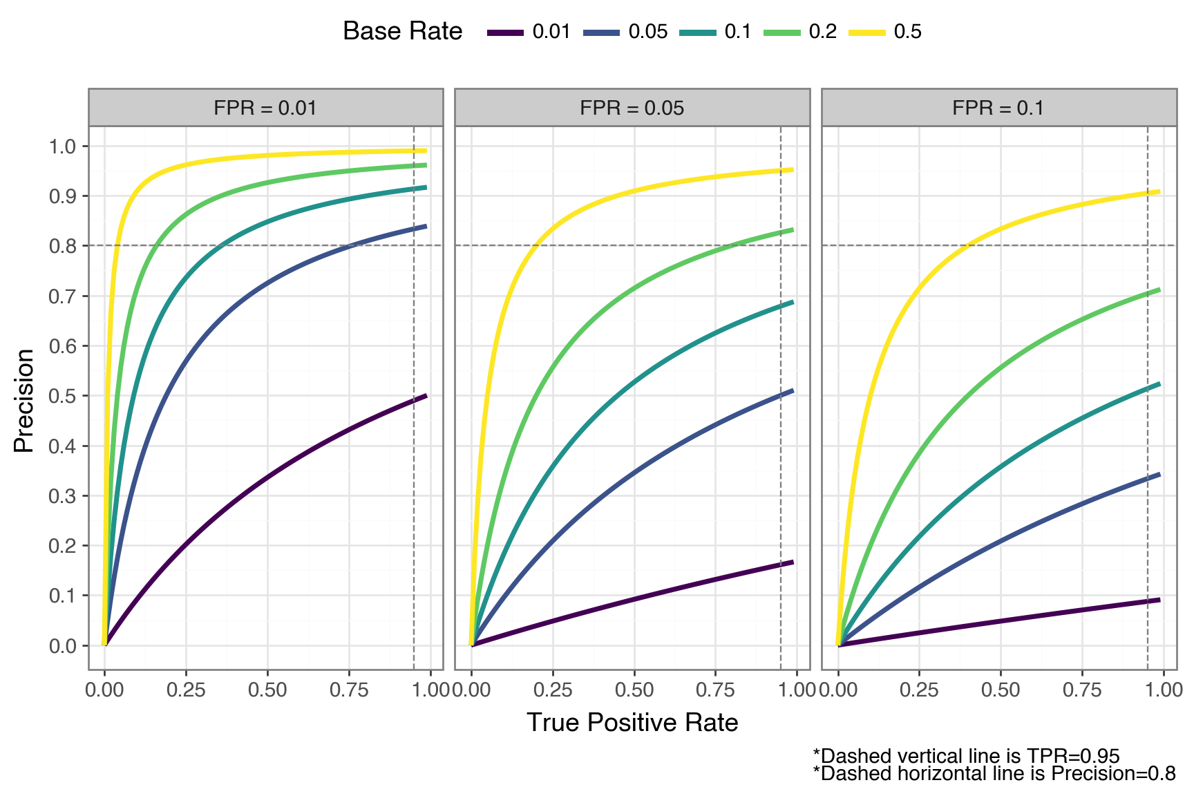
It’s worth sitting with this plot for a moment. The dashed line at 0.80 marks a common practical target (the point where at least 4 out of 5 flags are true positives).
Consider the best-case panel (FPR = 0.01). Even with a perfect TPR of 1.0, a base rate of 0.01 gets you only 50% precision. In this case, half of your flagged cases are still false positives. To break 80% precision at that base rate, you’d need an FPR well below 0.01.
Now look at the middle panel (FPR = 0.05). At a base rate of 0.05 and a TPR of 0.95, precision again lands around 0.50, and it only gets worse as base rate drops: at 1% base rate in that same panel, precision barely clears 0.15 regardless of how high your TPR goes.
The pattern is clear: when the positive class is rare, even small false positive rates generate a flood of false positives that overwhelm the true positives. The base rate acts as a hard ceiling on precision.
That ceiling has direct cost implications. At 1% base rate with precision at 0.16, 84 out of every 100 flagged transactions trigger unnecessary human reviews. If each review costs your team 15 minutes, you’re burning 21 hours of analyst time for every 100 flags, and you can’t do better than that with this model without changing the population you’re screening.
To see how hard it is to improve, consider what it would take at 1% base rate with perfect recall (TPR = 1.0). Hitting 50% precision requires FPR < 0.01, and hitting 80% requires FPR < 0.0025 — a 20x reduction from our starting FPR of 0.05. The base rate doesn’t just lower precision, it makes the improvement needed to claw it back grow steeply.
Everything above treated TPR and FPR as knobs you can set independently: “suppose a model has 95% TPR and 5% FPR., but a real model doesn’t work that way. TPR and FPR are both determined by a single decision threshold \(t\). If you lower \(t\) to catch more true positives, you’ll inevitably let in more false positives too. So the precision picture may be even worse once we account for the TPR-FPR coupling — and keep in mind that a model achieving 0.95/0.05 simultaneously is already very strong, so what follows is an optimistic bound.
To trace out the full trade-off, we need a model that produces actual scores we can threshold — not just a single pair of rates. A simple theoretical setup that lets us do this is the bilogistic model. The bilogistic model represents a binary classifier where the negative class yields scores from a \(\text{Logistic}(0, 1)\) distribution and the positive class from a \(\text{Logistic}(\mu, 1)\) distribution. The separation \(\mu\) controls how good the model is — a larger \(\mu\) indicates that the model is better at telling the two classes apart.
Here’s what this model looks like with an arbitrary separation of \(\mu = 4\). Any vertical line we draw becomes a decision threshold \(t\). Everything to the right gets classified as positive and everything to the left gets classified as negative. Sliding \(t\) left catches more true positives but also more false positives; sliding \(t\) right does the opposite.
mu_demo = 4
xrange_demo = np.arange(-8, 12, 0.1)

demo_df = pl.concat([
    pl.DataFrame({"x": xrange_demo, "y": logistic.pdf(xrange_demo), "class": "0"}),
    pl.DataFrame({"x": xrange_demo, "y": logistic.pdf(xrange_demo, loc=mu_demo), "class": "1"}),
])

threshold_demo = 2

# Build shaded region dataframes
x_left = xrange_demo[xrange_demo <= threshold_demo]
x_right = xrange_demo[xrange_demo >= threshold_demo]

shade_tn = pl.DataFrame({"x": x_left, "y": logistic.pdf(x_left), "region": "TN"})
shade_fp = pl.DataFrame({"x": x_right, "y": logistic.pdf(x_right), "region": "FP"})
shade_fn = pl.DataFrame({"x": x_left, "y": logistic.pdf(x_left, loc=mu_demo), "region": "FN"})
shade_tp = pl.DataFrame({"x": x_right, "y": logistic.pdf(x_right, loc=mu_demo), "region": "TP"})

(
    ggplot()
    # Draw larger correct regions first, then smaller error regions on top
    + geom_ribbon(aes(x="x", ymin=0, ymax="y", fill="region"), data=shade_tn, alpha=0.9)
    + geom_ribbon(aes(x="x", ymin=0, ymax="y", fill="region"), data=shade_tp, alpha=0.9)
    + geom_ribbon(aes(x="x", ymin=0, ymax="y", fill="region"), data=shade_fn, alpha=0.9)
    + geom_ribbon(aes(x="x", ymin=0, ymax="y", fill="region"), data=shade_fp, alpha=0.9)
    + geom_line(aes(x="x", y="y", linetype="class"), data=demo_df, size=1.5)
    + geom_vline(xintercept=threshold_demo, color="gray", size=1)
    + annotate("text", x=threshold_demo + 0.2, y=0.27, label="threshold t", color="gray", size=12, ha="left")
    + scale_fill_manual(values={"TN": "#4a90d9", "TP": "#5cb85c", "FN": "#e8935a", "FP": "#d9534f"})
    + labs(x="Score", y="Density", color="Class", fill="Region")
    + theme_bw(base_size=14)
    + theme(legend_position="top", figure_size=(8, 5))
)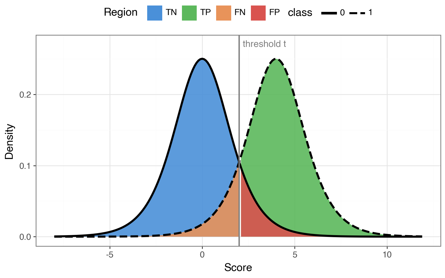
Because TPR, FPR, and precision are all determined by where we place that threshold, we can sweep \(t\) across the full range and trace out the complete trade-off.
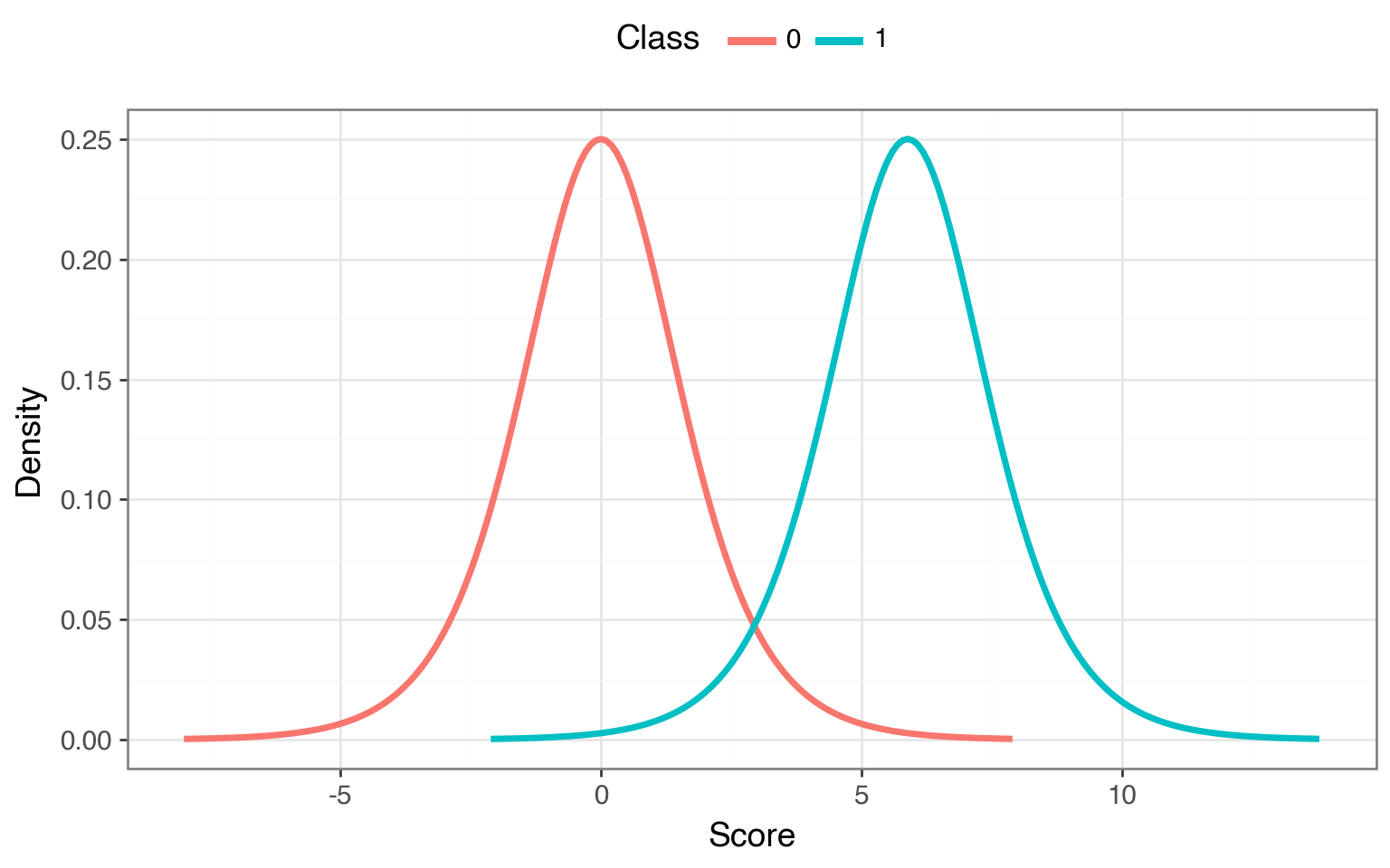
Using the bilogistic model, we can pick a \(\mu\) such that there exists a threshold where TPR = 0.95 and FPR = 0.05 simultaneously — matching the model from the previous section. Once calibrated, we can see what happens at every operating point as we move \(t\) from all the way to the left to all the way to the right.
Here’s what the curves look like for our calibrated bilogistic model:
def get_loc_p(tnr: float, tpr: float) -> float:
  """Find the location parameter mu for the positive class such that a single threshold t
  simultaneously satisfies both TNR and TPR. The threshold is fixed by the negative class:
  t = Logistic(0,1).ppf(TNR). Then mu is chosen so that the positive class CDF at t equals
  1 - TPR, i.e., Logistic(mu,1).cdf(t) = 1 - TPR."""
  z_n = logistic.ppf(tnr)

  alpha = 1 - tpr
  loc_p = z_n + np.log((1 - alpha) / alpha)

  return loc_p

loc_n = 0
loc_p = get_loc_p(tnr=0.95, tpr=0.95)
# print(f"{loc_p = :.2f}")

scale = 1

xrange_n = np.arange(-8, 8, 0.1)
xrange_p = xrange_n + loc_p

neg_df = pl.DataFrame({
  "x": xrange_n,
  "y": logistic.pdf(xrange_n),
  "class": "0"
})
pos_df = pl.DataFrame({
  "x": xrange_p,
  "y": logistic.pdf(xrange_p, loc=loc_p),
  "class": "1"
})

dist_df = pl.concat([neg_df, pos_df])

(
    ggplot(dist_df, aes(x="x", y="y", color="class"))
    + geom_line(size=1.5)
    + labs(x="Score", y="Density", color="Class")
    + theme_bw(base_size=14)
    + theme(legend_position="top", figure_size=(8, 5))
)
Let’s compute both the ROC curve and the so-called Precision-Recall curve (where recall is just another name for TPR) by computing the TPR, FPR, and precision as we sweep \(t\) across the two distribution.
t = np.arange(-10, 14, 0.01)

# TPR and FPR are the RHS of the curve for the pos & neg distributions
tpr = 1 - logistic.cdf(t, loc=loc_p)
fpr = 1 - logistic.cdf(t, loc=loc_n)

auroc = -np.trapezoid(tpr, fpr)roc_df = pl.DataFrame({"x": fpr, "y": tpr})
roc_dot = pl.DataFrame({"x": [0.05], "y": [0.95]})
pr_dfs = []
pr_dot_rows = []
for br in base_rates:
precision = (tpr * br) / (tpr * br + fpr * (1 - br))
pr_dfs.append(pl.DataFrame({
"x": tpr,
"y": precision,
"base_rate": str(br),
}))
prec_at_point = (0.95 * br) / (0.95 * br + 0.05 * (1 - br))
pr_dot_rows.append({"x": 0.95, "y": prec_at_point, "base_rate": str(br)})
pr_df = pl.concat(pr_dfs)
pr_dots = pl.DataFrame(pr_dot_rows)
common_theme = (
theme_bw(base_size=14)
+ theme(legend_position="top")
)
roc_p = (
ggplot(roc_df, aes("x", "y"))
+ geom_line(size=1.5, color="orange")
+ geom_point(data=roc_dot, size=3, color="red")
+ scale_x_continuous(limits=(0, 1))
+ scale_y_continuous(limits=(0, 1), breaks=np.arange(0, 1.1, 0.1))
+ labs(x="FPR", y="TPR", title=f"ROC (AUROC = {auroc:.3f})",
caption="*Red dot marks TPR=0.95 / FPR=0.05")
+ common_theme
)
pr_p = (
ggplot(pr_df, aes("x", "y", color="base_rate"))
+ geom_line(size=1.5)
+ geom_point(color="red", size=3, data=pr_dots)
+ scale_colour_cmap_d()
+ scale_x_continuous(limits=(0, 1))
+ scale_y_continuous(limits=(0, 1), breaks=np.arange(0, 1.1, 0.1))
+ labs(x="Recall", y="Precision", color="Base Rate", title="Precision-Recall",
caption="*Dots mark TPR=0.95 / FPR=0.05")
+ common_theme
)
(roc_p / pr_p) + theme(figure_size=(8, 8))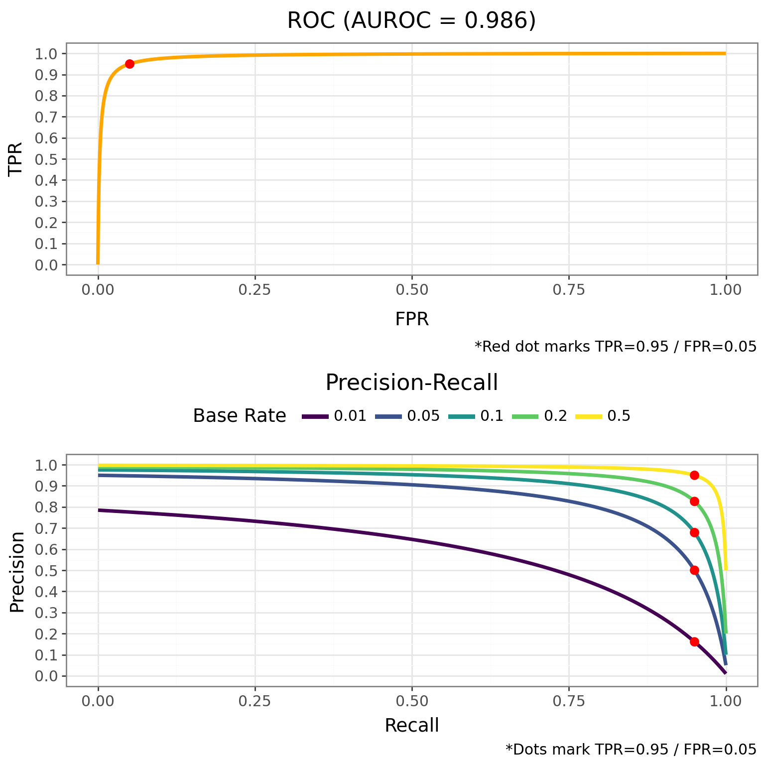
The contrast is stark. The ROC curve on top looks excellent — it hugs the top-left corner, and the AUROC is near perfect. But notice that we didn’t need to consider base rates at all to compute the ROC curve. It’s completely invariant to base rate. Because the TPR and FPR are both conditioned on the true class, the base rate never enters the picture, and that curve will look identical whether 1% or 50% of transactions are fraudulent — which makes a near-perfect AUROC actively misleading in low-base-rate settings.
On the other hand, the PR curve on the tells a different story. At a 1% base rate, the curve collapses — there’s no threshold that gives you both high recall and high precision. To push precision above 0.5, you have to sacrifice most of your true positive rate. As the base rate increases, though, the trade-off becomes much more forgiving.
Earlier we assumed a model could hit TPR = 0.95 and FPR = 0.05 simultaneously. The PR curve reveals what the full trade-off actually looks like: at a 1% base rate, pushing precision above 0.16 means sliding the threshold right and catching fewer frauds.
These curves help us see that the base rate doesn’t just hurt precision at one operating point, but rather it affects the entire trade-off curve.
If you’re working in a low-base-rate domain, the PR curve should be your primary evaluation tool because it better reflects what your team will actually experience.
Base rates can set a ceiling on precision that’s far lower than most practitioners expect — and the model improvement needed to overcome it grows steeply as the base rate drops. You can push past the ceiling with a better model (lower FPR), but the required improvement is typically much larger than people intuit. That ceiling is also a cost floor: if most of your flags are false positives, every flag carries the cost of a review.
If you’re working in a low base rate setting — fraud detection, rare disease screening, content moderation — it’s worth computing that ceiling before you start tuning your model.
You might have noticed that the x-axis in the bilogistic density plots doesn’t have obvious units. It represents the model’s logit output — the log-odds score a classifier produces before converting to a probability. The threshold \(t\) is just a cutoff on this logit scale: everything above \(t\) gets classified as positive.
This connects directly to logistic regression through its latent variable formulation. The idea is that behind every observed binary outcome \(y \in \{0, 1\}\), there’s a continuous latent variable \(y^*\) that determines the class:
\[ \begin{align} y_i^* &= X\beta + \epsilon_i, \quad \epsilon_i \sim \text{Logistic}(0, 1) \\ y_i &= \begin{cases} 1 & \text{if } y_i^* > 0 \\ 0 & \text{otherwise} \end{cases} \end{align} \]
The latent score \(y^*\) is exactly the logit-scale quantity from our bilogistic model. For the negative class (\(X\beta = 0\)), latent scores follow a Logistic\((0, 1)\) distribution. For the positive class (\(X\beta = \mu\)), they follow a Logistic\((\mu, 1)\). The threshold at 0 plays the role of our decision boundary. In other words, every time you fit a logistic regression, you’re implicitly working inside the bilogistic framework — and the base-rate ceiling on precision applies directly to your model’s predictions.
Let’s verify this correspondence by simulating data from the latent variable model using the same separation \(\mu\) we calibrated earlier, then fitting a logistic regression to recover \(\mu\).
n = 10_000
group = np.repeat([0, 1], n // 2)
X = np.column_stack([np.ones(n), group])
B = np.array([0, loc_p])

e = logistic.rvs(size=n)
ystar = X @ B + e

latent_df = pl.DataFrame({
  "group": [str(i) for i in group],
  "y": ystar,
})
The density of the latent scores by group recovers the same two-distribution picture we saw earlier:
(
    ggplot(latent_df, aes(x="y", fill="group"))
    + geom_density(alpha=0.5)
    + labs(x="Latent score (logit)", y="Density", fill="Group")
    + theme_bw(base_size=14)
    + theme(legend_position="top", figure_size=(8, 5))
)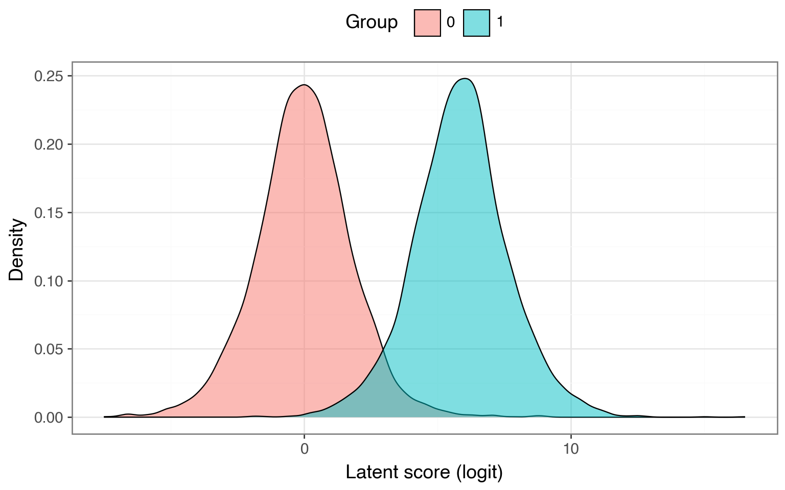
Now let’s threshold \(y^*\) at 0 to get the observed binary outcome and fit a logistic regression. If the models correspond, the estimated group coefficient should land close to \(\mu \approx\) 5.89.
import statsmodels.api as sm

yobs = (ystar > 0).astype(int)
model = sm.Logit(yobs, X).fit()
print(model.summary())
Optimization terminated successfully.
Current function value: 0.351208
Iterations 11
Logit Regression Results
==============================================================================
Dep. Variable: y No. Observations: 10000
Model: Logit Df Residuals: 9998
Method: MLE Df Model: 1
Date: Tue, 14 Apr 2026 Pseudo R-squ.: 0.3761
Time: 21:01:16 Log-Likelihood: -3512.1
converged: True LL-Null: -5628.8
Covariance Type: nonrobust LLR p-value: 0.000
==============================================================================
coef std err z P>|z| [0.025 0.975]
------------------------------------------------------------------------------
const 0.0008 0.028 0.028 0.977 -0.055 0.056
x1 6.7234 0.409 16.420 0.000 5.921 7.526
==============================================================================The estimated coefficient for x1 (the group indicator) lands close to the true \(\mu\) we used to generate the data. The logistic regression recovers the separation between the two distributions — the same parameter that controls model quality in the bilogistic framework.
Base rates can also be called priors or prevalence, depending on the setting↩︎